Wednesday, May 27, 2015

The Broader Photography Community

In terms of continuing your involvement in photography, here are some ideas for those taking it to the next level:

Contests and Portfolio reviews are a good idea, especially if you want to try and get your work in front of magazine editors, curators or gallerists. Entry fees for contests are usually under $100. Portfolio reviews can be much pricier. Here's an annual one in Palm Springs that is popular.

Photo Alliance: A Bay Area based org dedicated to contemporary photography. http://www.photoalliance.org/


SF Cameraworks: http://www.sfcamerawork.org
Local photo collective with photo related gatherings and exhibits

The Palo Alto Art Center hosts photo related workshops and classes

Filoli in Woodside also occasionally has photo related classes and workshops.

This blog is an amazing resource, updated regularly. It has current listings for national photo related events and contests via photography marketer Mary Virginia Swanson: http://mvswanson.com/category/mvs-marketing-blog

PDN is a photo industry magazine with annual contests (PDN Photo Annual is very well respected in the field)

Critical Mass/ Photolucida: http://www.photolucida.org/current.php
Photo organization offering contests and portfolio reviews
(Current contest open through July 16)

For photo business resources:
APA - American Photographic Artists
ASMP- American Society of Media Photographers

Photo Festivals and Portfolio Reviews
Photo Lucida
Photo NOLA
PDN Photo Plus
Review Santa Fe
Powerhouse Portfolio Review in Brooklyn
New York Photo Festival (events and reviews)

Women in Photography has ongoing Calls for Submission

Exhibiting your work: A lot of galleries have annual calls for submission where you pay an entry fee in the hope of getting chosen to have your work in a group show. Look on the website of a favorite local gallery to see if they offer this. Several galleries in Half Moon Bay offer juried shows, including the Coastside Land Trust.

Artist collectives like Gallery House in Palo Alto can be a good way to be part of the larger local artist community

Residencies are available worldwide for serious photographic artists, like Lightwork.

Selling prints of your work on etsy.com is another outlet.

Putting Images Online

Standard Image Size for web:

-72dpi (resolution)
-Usually not wider than 600px

How to save images for Web:

****BE SURE**** NOT to save your original images as web size!!!! RESIZE DUPLICATES ONLY!! Saving an image for web shrinks it and you won't be able to get the original size back!! So it must be done on a duplicate ****

So first, make duplicates of all your master retouched files that are most likely TIFFS if they have layers. If you have them all in a folder, go to FILE > SCRIPTS > IMAGE PROCESSOR. Make them all JPGS in a new folder (do not reduce file size). Should look like this (it will create a new folder of duplicates):


Then....

Save this folder of duplicates to web size by going to FILE > SAVE FOR WEB. This automatically makes the new images 72dpi.
Be sure to save as JPEGs that are approx 600px wide:


Batch Save a Whole Folder Web Size by writing an ACTION:

If you want to save a whole folder of images at web size, you can write an action:
1.) Open an image
2.) WINDOW > ACTIONS to make your actions tab visible.
3.) Make a new action by clicking the "new action" icon at the bottom (looks like a page with the corner folded). Name it, and then RECORDING starts when red light is on!
4.) First thing to record:  IMAGE > IMAGE SIZE. Change "pixel dimensions" width to 600 px. (Don't change resolution or document size. Leave all boxes checked at the bottom. Have "Bicubic Automatic" selected)

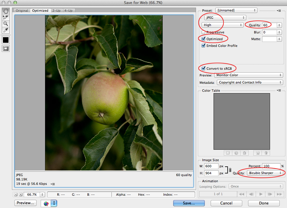
5.) Now go to FILE > SAVE FOR WEB. Be sure to have optimized checked and to save as a "high" 60 quality JPEG, Optimized checked. At the bottom choose Bicubic Sharper (this is best for downsizing images). ** You don't need to change image size- it should already be set to 600px wide.

6.) Click "Save" and have it go to a folder you've called "web size images". (Don't rename images, as it can throw off the action. You can rename later in Bridge via TOOLS > BATCH RENAME). Close the image. Don't Save.

7.) Stop your action by hitting the square "stop" button at the bottom of the actions palette.

8.) This has now saved a duplicate of the image as web size! You can now go to FILE > AUTOMATE > BATCH to run that action on a whole folder of images.

Each resulting image should be 600px wide at 72 dpi and ready to email or publish online (to check, go to IMAGE > IMAGE SIZE):

*Sometimes you may notice that once your images appear online they look a little desaturated. If so, you can always go back and boost colors in Photoshop with an S Curve or by adding a little saturation with an adjustment layer, and then re-publishing it online.

*****

Embedding Copyright, Naming Files & Watermarking:

File naming: Using Bridge, you can rename all your files to be consistent and have your name in them, for example, gleeson_web_01.jpg, gleeson_web_02.jpg, gleeson_web_03.jpg...
*I like to name my files with "web" or "Print" in the title so I know which size each JPG is and don't accidentally print a web size image. In Bridge TOOLS > BATCH RENAME (be sure to have the images you want to rename highlighted for it to work).

Copyright: In Bridge, you can create a new Metadata template with all your info in it. Go to TOOLS > CREATE METADATA TEMPLATE. Then in the future, you can apply this to any image you want by going to TOOL > REPLACE METADATA.

Watermarking: In Bridge via the Output Tab, you can make a PDF that has watermarked images either with text or a logo. To watermark individual images you can use the Type Tool in Photoshop and write "Photo by ____" on a new layer, then change the opacity of that layer to be slightly transparent.


Creating an Online Portfolio:

If you don't have a website, you may think about trying this free online portfolio service called Carbon Made: http://carbonmade.com. Here's an examples of a portfolios by a former students of mine: http://hanspurwa.carbonmade.com/   http://dianabphoto.carbonmade.com

Another option that connects to Flickr is http://pullfolio.com

I use Photo Biz, photobiz.com, for my website www.eringleeson.com. It's a drag and drop template for people like me who don't know HTML and web design. Super user friendly, and is about $15/month.

Some free blog formats that are available are Blogger (via gmail), Wordpress (highly customizable templates), Tumblr (built in social media). Each of these offer templates you can buy.

For example, my website/blog The Forest Feast is a Tumblr blog. Although my template is not as customizable as a Wordpress template might be, I wanted to built in social media aspect to attract followers and drive traffic. I bought a $75 template from Pixel Union, and because I wanted something more memorable than forestfeast.tumblr.com, I went to Go Daddy and bought the domain name www.theforestfeast.com and had the 2 connected, for approx $15/year.


Wednesday, May 20, 2015

Creative Collage + Filters

Adding Texture/ Blending Mode Multiply

To create antiquing effects, you can use images found online or you can shoot or scan textures you like. You can also photograph textures specifically for this technique. Drag the antique paper (or whatever texture you've found) to the top layer of your image. Change the blending mode of that layer to MULTIPLY and adjust the opacity as needed.


Notice the blending mode of the layer with the paper scan is "Multiply". You can also make a mask, and paint in with black and a low opacity brush to lessen the effect on certain areas of the image (like the face).

Extracting elements of scans for collage:
I found a scan of an old book where I liked the gold leaf border:

Select a certain area by using Select > Color Range (or the magic wand tool).  I made a selection of the gold border and copied and pasted it into a new empty layer (command C, command V).

Use 'Command T' (free transform) to change the size of the border to fit your image.


Download-able textures:

http://www.mayang.com/textures/

A lot can be found online, but be careful about using copyrighted imagery.


ACTIONS:
You can write your own action by opening your actions tab and clicking the new action icon at the bottom (page with corner folded). Anything you do will be recorded (until you press stop). You may consider recording a series of adjustment layers (like de-saturation, increased contrast, black and white, sepia etc) for an effect you like, then you can play it again later on another image.

PRESETS:
Presets are just for the RAW window. You can write your own and record the steps you have done (all the sliders you have adjusted) on the Presets Tab. (see below) You can also download Presets. You may consider de-saturation, increased contrast,and adding a vignette.


PLUG-INS:

There are a variety of downloadable plugins which have automated effects and which you launch through the Photoshop interface (usually via File > Automate). Some are free and others you have to buy. I have not purchased any of these but some students have suggested the following:

http://www.ononesoftware.com/products/suite7/
http://www.alienskin.com/exposure/
http://www.niksoftware.com/nikcollection/usa/intro.html


Compositing with Pen Tool, etc.

When you combine elements from different images into one, it's called compositing. The main task in doing this is "Selection". You can select a certain area of an image to paste it elsewhere using several different methods. For items with hard defined edges (like this bottle below), you could use the magnetic lasso, magic wand or the (most precise) pen tool. The Pen Tool creates a path, which can then be turned into a selection. For cutting out something with a fuzzier outline (like someone's hair, or a furry cat) it's a bit more complicated. You'll want to use a method like channels, refine edge or quick selection (see below).


Pen Tool:

The Pen tool is the most precise way to select an area of an image. For example, if you want to cut someone out of an image and place them on a new background, you can trace the outline of the person most accurately with the pen tool.

The Pen tool does not write, it is just used to make a selection. You use it to make a path: a path is created by making several points on the perimeter of a that person you want to cut out . You then "connect the dots" to create an outline. This series of "dots" or anchors that you make is called a path. To see your path as it's created, go to WINDOW > PATHS and make sure there is a check next to it.

I generally work clockwise around the perimeter of an object to make a path. Make sure you are zoomed WAY in (like to 200%). Click to make an anchor. Click and pull to make an anchor with 2 arms that will create a curve.

Take this image for example. The original photo looks like this:


It was photographed on a white background, but looks grayish, and needs to be cut out and placed on a perfectly white background to look like a clean product shot. So we use the Pen Tool to cut it out, and create a new drop shadow:


After tracing around the entire bottle with the pen tool, I turned the path into a selection by clicking the little dotted circle at the bottom of the paths palette. (Path and anchors must be live/visible for this to work. If it's not working, click on your path with the pen tool until you can see the anchor points. Then click the dotted circle).

Notice the order of my layers above. On new separate layer under the bottle, fill that same shape with gray. EDIT > FILL with 50% gray. Lower the opacity and FILTER > BLUR> GAUSSIAN BLUR to make the shadow look more natural. Command T (EDIT > FREE TRANSFORM) to make the shadow change position. You can also try EDIT > TRANSFORM > SKEW:


MORE ADVANCED COMPOSITES: 

For areas with fuzzy outlines, like a furry cat or someone's hair, making a selection using Refine Edge can be more successful.

Compositing with Quick Selection Tool:

  1. Place the image of the subject on top of it’s new background
  2. Using the quick selection tool, make a selection of the subject. Use a small brush for detailed areas and to be more precise. Hold down command for the “minus” tool.
  3. Select > Refine Edge. Use the “On layers” view.
  4. Use the refine radius tool (next to "edge detection” to go around edges, especially hair.)
  5. Export as a layer mask. Continue to refine the mask with black or white brushes as needed.


Here's another helpful video about making selections around soft edges like hair:


This photo below is by one of my students, Dona Foster. The new background (her idea) is a scanned in piece of old paper. This image worked especially well because there was a monotone background. You can use the quick selection tool to select the bird, then hit the Refine Edge button to separate the bird from the background. Afterward, you can paint on the mask to bring in any extra detail your quick selection tool might have missed. Add the scanned paper in as a layer underneath.


Multiplicity Masking Exercise

By taking several images in sequence, you can layer them in Photoshop to create a photo like the one above.

Above, I took 5 shots in a row as the girl walked across the frame. Although I held the camera as still as possible, I was not using a tripod, so I had to align the images before masking.

  1. Shoot several images in a row with the same framing, having a subject move throughout the frame
  2. Open each file in Photoshop. Start with one image, then Select > All, and Copy > Paste each image on top of that initial photo, creating a stack of layers like you see above.
  3. Unlock the background image by double clicking on it, then hitting "OK" when you see the window pop up labeling it now "Layer 0".
  4. Highlight all the layers by shift clicking them.
  5. Go to Edit > Auto Align Layers. Click OK for the "auto" version.
  6. Now that the images are aligned, you can begin to mask. Add a mask to all the layers except the bottom one. Invert each mask to make it black.
  7. Using a soft white brush, paint on the mask over the area where the girl stood in each frame.

Monday, May 18, 2015

Compositing (combining images) via Masking

The photos below were taken by Chris Ozer for Lynda.com. They were taken moments apart and the subjects didn't move much, and because of that they can be stacked on top of each other and combined easily. We want his face from one image and her face from the other to make a better shot.

Here's how you do it:

First, open both images into Photoshop.
I started with the image of her with her eyes closed. SELECT > ALL. Then EDIT > COPY.


Then click over to the other image of her with her eyes open, and EDIT > PASTE. Now you should have a file with the 2 photos stacked on top of each other as 2 layers. I renamed the layers (by clicking on the text) so I don't get confused:

Now highlight both layers by shift clicking, so that they are both blue. Then go to EDIT > AUTO ALIGN to stack the layers perfectly:
Once the image layers are aligned, you can crop the image if need be. Then make a mask on the top layer by clicking the icon at the bottom of the layers palette that is a square with a circle in the middle:
Get a soft black brush and paint on the white mask over her face to reveal the open eyes that are on the layer below:
You now have the best of each image! We have just used Masking to create a composite.

Final Project Due May 27th


For those students taking the class for a grade, here are the guidelines for the final project due on the last day of class. Even if you are not taking the class for a grade, please feel free to make prints or an online portfolio to share with the group on the last day.

The final assignment for the grade is to bring on the last day:

  • 6 digital files, saved with layers in .PSD or .TIF form. You can bring them on a flash drive and copy them to my computer on the last day. Try to choose 6 images that go together somehow. Please use some of the techniques that we have learned in class to edit these photos in Photoshop, such as sharpening, adjustment layers, retouching tools, etc.
  • These same 6 images saved web size as .JPG, turned in digitally.
  • Upload the 6 JPGs to an online portfolio. You can use your own blog/website or you can use a free service like carbonmade.com
  • Prints of the 6 images at approximately 8x11inches. You can make prints anywhere, but I suggest bayphoto.com

Wednesday, May 6, 2015

Portrait Retouching


PORTRAITURE


*see the slideshows in the dropbox folder for some inspiration

Portraiture can mean many things. Environmental portraits of people show someone's surroundings and close up portraits can be more about a personal's expression or emotion. Stories are told in different ways.
environmental portrait by Joel Sternfeld
close-up portrait of Picasso by Richard Avedon (notice the side lighting)


Lens Choice:
Lens Length Impacts Portraiture!
In taking pictures of people choosing a longer lens (like above 50mm) is generally more flattering. Try standing farther away from your subject and zooming in if you have a zoom lens.
Image on left is a wide angle (like a 18mm lens). Image on right is a longer lens (like 85mm) Image credit here.
My favorite lens for portraits is the 50mm f1.8. You can find it at B&H here. You generally want to use a 50mm or longer lens when shooting a portrait (I'd say 50-100mm. Some say 80mm is the best.)

It's not very wide, so you will want a zoom lens as well. The more expensive ones that go to f2.8 are the nicest and assure that blurry background. Something like one of these.

I also have a fixed 28mm f2.8 lens I love. They say prime lenses (those that don't zoom" are a bit sharper. This is a bit too wide for a portrait, but great for group shots.

PHOTOSHOP TOOLS for portrait retouching:


QUICK SUMMARY: Retouching a portrait:
Process the RAW file and open it in Photoshop.
-Layer 1 (bottom of stack) = Background
-Layer 2 = Background Duplicate (Duplicate the background, call it "retouching" or "patch and clone stamp". Fix skin here) You may also like to use the Healing Brush Tool for skin.
-Layer 3 (top of stack) = Curves "brighten layer" for brightening under eyes, whites of eyes, teeth, etc:


THE DETAILS: Basic Portrait Retouching **be sure to zoom in to 100% or 200%

We work from the bottom layer up. Each time you add a new layer, it should get added to the top of the layer stack. It's important to work in this order and add new layers to the top of the layers stack as you move along. 

1.) Retouching Layer/Blemishes: Duplicate background layer by dragging it down to the little icon at the bottom of the layers palette that looks like a page with the corner folded. This duplicate layer is where you should do your blemish and spot removal. Using a combination of the following tools, Clone Tool, Healing Brush Tool, Spot Healing Brush Tool, Patch Tool and filling with content aware to rid of all blemishes and stray hairs. Turn brush hardness all the way off, to 0% so that your brushes are soft. Experiment with the opacity of each tool as well.  (Clone & Healing brush tools also work on empty layers if you choose “sample all layers” from the bar at the top.)


2.) To Add Slimming (optional) : FILTER > LIQUIFY. Add this to the above retouching layer, or if you think you may want to "turn it off" later, do it on a separate layer by Duplicating the “retouching” layer and call it “Liquify”.  Liquify minimizes double chins, chubby cheeks, odd facial angles, crooked bangs,  bunched up clothing, etc. Set Brush Pressure and Brush density to “17”- this is a good starting point. Use a fairly large brush.


3.) Decreasing Wrinkles: Make a new empty layer (click icon at the bottom of the layers palette that looks like a page with the corner folded). Using the healing brush, option click a "good" source area and heal over the wrinkles. Or try the spot healing brush. Make sure "all layers" is selected from the drop down menu at the top (otherwise it won't work to heal on an empty layer). The advantage of healing on an empty layer is that it won't increase your files size too much. The advantage to working on wrinkles on a separate layer is that you can decrease the layer opacity without affecting other retouches.


4.) Decrease Redness: You may need to selectively decrease redness in certain parts of the face. To do this, make a new "Hue/Saturation" adjustment layer from your adjustments palette. Change "Master" to "Reds" and move the slider to the left on the Properties panel. Invert the mask that has been created for you on the layers palette (command i for a Mac/ control i -PC). Paint with a big, soft white brush (B) on the mask to reveal the change (and decrease reds in certain areas).

5.) Brightening with Curves. This is great for brightening under eyes, brightening shadow areas and adding highlights to hair. Make a new curves layer, push the curve slightly from the middle to the top left corner (see below), invert (command i) the mask and paint with a soft white brush on the areas you want to become brighter. You can always decrease the opacity of the layer if the effect is too strong.

6.) Teeth: you can take some yellow-ness out of teeth and brighten them up a little using a Hue Saturation layer. See step #4, except change "Master" to "Yellows". And move the "Lightness" slider to the right to make the teeth brighter. (*note: you can select the teeth first using the lasso tool, or you can simply paint over the teeth on the mask)

Here's an overview of the final layers palette incorporating all the steps I mentioned above:

image source: Lynda.com 


WHEN DONE....Save as TIFF of PSD to maintain layers. Save another copy as a JPG to be able to email it, make a print, upload it, etc. The TIFF/PSD is your Master File and if you want to make any edits layer, you'll go back to the TIFF/PSD.


Sharpening

There are several different methods to sharpen an image. I recommend Smart Sharpen. You can sharpen certain areas of an image during retouching if you make a mask (like the eyes, or the hair, or the flower, or whatever you want to be the center of attention). Before you print, it's a good idea to sharpen the whole image just a little ("output sharpening"), as making a print can reduce the sharpness of an image just a bit. But be careful not to oversharpen!

*Remember that all sharpening needs to be done on a new merged layer on top of the layers stack, ideally after you are done with all other retouching. To make this new merged layer, go to Select > All, Edit > Copy Merged,  Edit > Paste. (Or the shortcut is Command/Shift/Option/E all at the same time.)

Smart Sharpen: 

1. First, make a background copy or make a new merged layer on top of the stack (see above).

2. Go to FILTER > SHARPEN > SMART SHARPEN. Depending on your file, you will likely want an "amount" of 100 to 200, and a "radius" of 1-3. 


If you want to do selective sharpening, you can make a mask, invert the mask (command i) and then paint with a soft white brush on the areas you want to be sharpened.


Be sure to save as a .TIFF or .PSD file to maintain your layers.

Choosing the Right Lens

Prime LensesDon't zoom, they are fixed in one position. Advantage: generally cheaper and produce more sharpness/crispness/clarity. Disadvantage: you have to switch lenses often or move around! And you may have to buy several prime lenses to cover your bases, instead of one zoom lens.

Zoom Lenses:
Advantage: you don't have to move as much to get the shot you want, and don't have to switch lenses often. Disadvantage: more expensive, heavier, less sharpness.


What's the Difference between Fast and Slow Lenses?

"Fast" Lenses = you can shoot in lower light (fast lenses go to a low F-stop number, like F1.8 or F2.8)

"Slow" lenses = not great in low-light (slow lenses don't generally go to an F-stop number lower than F4 or F5.6)


Lenses are measured in length, by Millimeters (mm):

-Wide Angle (16mm, 24mm, 35mm...): show more of the scene
-Long (100mm, 200mm, 300mm...): Shoot things farther away (like a telephoto lens)
-Mid-range "normal" lenses are somewhere in between (40mm to 80mm? although it depends on the size of your sensor because lenses on full frame cameras will appear wider...see below).


Longer Lenses Condense the Background. See example image below (image credit: Lynda.com):

Image on left: 100mm lens.  Image on right: 24mm lens. (The photographer shot with a zoom lens and walked closer to the subject when taking the the wide angle shot on the right to be able to crop it the same.)

See how the background looks more condensed and closer in the image on the left? This can also be more flattering when taking portraits, as it doesn't spread the features as much (image credit here.)

Image on left: wide angle lens (24mm?). Image on right: longer lens (100mm?).

How does your sensor affect your lens? 

Cameras with a full frame sensor will make lenses seem wider. (These are generally more expensive or professional cameras so may not affect you). If you upgrade your DSLR to a full frame sensor camera, you may notice your lenses suddenly seem wider. (Some lenses may not be compatible when you upgrade).

In addition to an offered aperture (like F2.8) and length (like 50mm), lenses also contributes to the overall Color, Contrast and Sharpness of your image. Whereas these elements can be added later in Photoshop, it can often be to your advantage if it's done in the camera and offer a unique creative style.